
 I have conducted an experiment with two of my grand-daughters, and this blog post is my report. Please don’t call the police or social services. No children were harmed in the making of this blog.
One day recently, Frances and I were minding Amy (11) and Celia (8), during their summer holidays from school. At a time when there was nothing special to do, I lined them up (not simple) and issued the following instructions:
Here’s my phone with the camera app switched on. I would like you please to go anywhere in the house and garden and each to take pictures of ten objects from my collections. Choose anything you like: ceramics, rugs, pictures, furniture, books, anything. When I have your images, I’m going to ask you about them, and then write up the results in my blog.
They both rapidly grasped the nature of the task, and went for it with a will, first Amy and then Celia. It was important that they carry out the task individually so that they didn’t influence each other.
I didn’t have any preconceived notions of which objects they would choose, but I was slightly anxious. If they selected only boring things or obvious things, it would make my blog post boring and obvious. What if they duplicated each other’s choices? What if they snapped lots of examples of only one type of object? What if their attention wandered and they only took pictures of their toys? What if they made choices in order to please Grandpa instead of to please themselves? What if I didn’t get my phone back?
I didn’t have very long to worry. Less than half an hour later, there were 20 new photos on my phone. Then I sat each child down and asked her why she had chosen each object and what she liked about it.
In the event, they both showed remarkable taste and discernment. As far as I could tell, most of their selections were made because they liked the object or found it interesting or intriguing, and not because they knew it was a particular favourite of mine. And the reasons they gave for making their choices indicated genuine thoughtfulness and some surprisingly sophisticated insights.
In order to keep this post to a reasonable length, I have made an editorial intervention and included just 12 objects out of the 20 selected by the girls, 6 for Amy and 6 for Celia. And I have also re-photographed some of the objects.
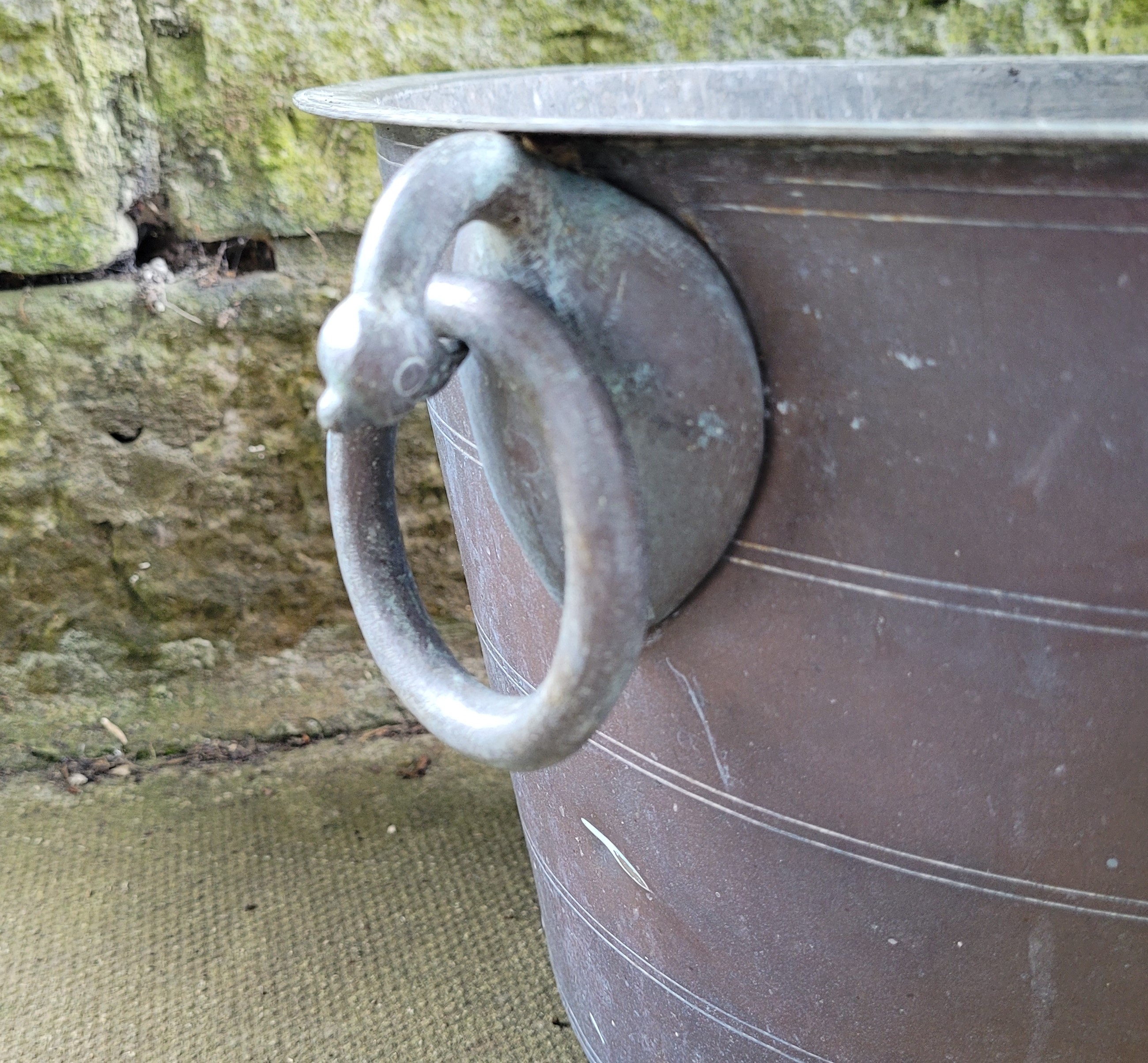
Amy: Bronze Bucket

I chose it because it’s a special bucket and it’s made of metal. You don’t see many metal buckets. They are not common nowadays. I think it’s from Japan or China or somewhere where they use symbols rather than letters.
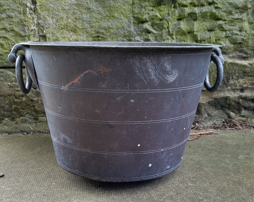
I know almost nothing about this object. It is part of a lot that I bought at a local auction some years ago on a whim: a large, heavy bronze bucket with a slightly convex base and two ring handles attached through the necks of stylised birds. Also in the lot were several lengths of ornate bronze chain and a timber platform covered with blue melamine laminate. Not the sort of thing I usually buy, but I liked it and wondered what might be done with it as a project.
The object (or group of objects) was described in the sale catalogue as a weighing machine, and I’m almost certain that is what it is: a platform balance scale missing its vertical post and pivoting beam. I guess you would have placed items for weighing in the bucket (perhaps loose ingredients such as grain or sugar or spices or fruits or vegetables?), and then placed weights on the platform as the counterbalance. Or the other way around.
The bucket has some letters or numbers incised on its out-turned upper rim. I can’t read them and don’t know what they signify. They might be in an Indian or perhaps Thai script, or any one of hundreds of other alphabets which I can’t recognise. This makes me feel inadequate.
Needless to say, the project didn’t happen. The platform is in the shed. The chains are in the attic. For several years the bucket has lain inverted just outside the back door where the children pass it en route between the kitchen and the garden. It is a rather nondescript item in itself, and you might not give it a second glance. But upon inspection it has a definite (if mysterious) appeal, and Amy has done well to notice it.

Celia: Vase by Alan Wallwork

It’s a circle. It’s a vase which you can put flowers in. I like it for its potteryness. I like the way the pattern is spread out in a circle, and I like the colour like toast which is burnt.
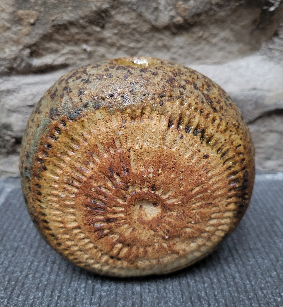
It would be difficult to add anything meaningful to Celia’s precise description of this small vase by Alan Wallwork (1931 – 2019) one of the greatest and most famous of British studio potters. It is indeed circular, and is decorated on both sides with circles of boldly-incised lines. It is indeed a vase, with a small opening in the top. The burnt-toast colouring is characteristic of the potter’s work, and the potteryness of the piece, made in a heavy and slightly rough stoneware, speaks for itself.
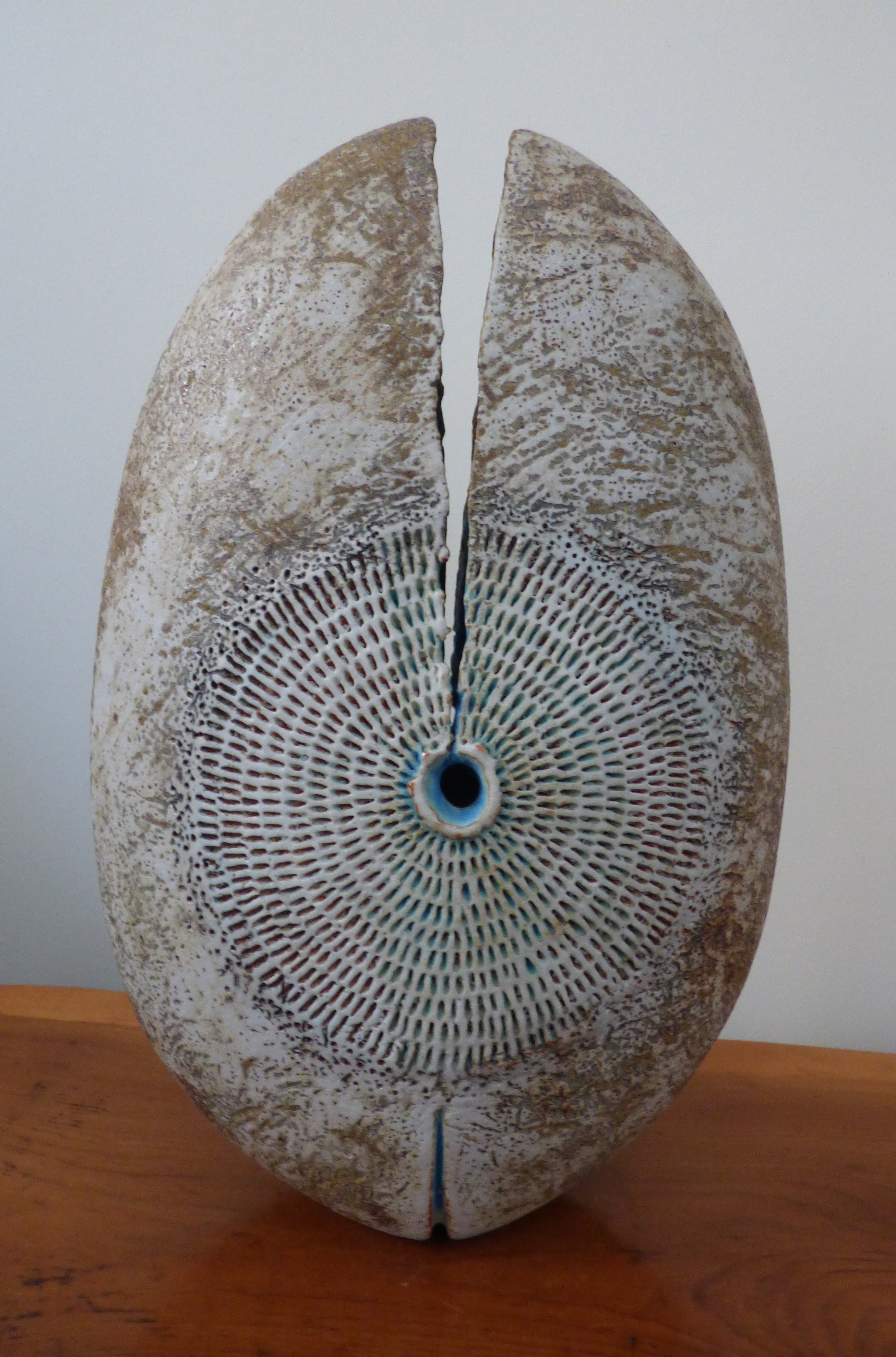 The vase was found in a charity shop. On another occasion, in a different charity shop, I found larger Alan Wallwork piece, which I like so much that I gave it a full page colour illustration in my book Random Treasure, and also featured its picture on the front cover. Somehow (can’t remember how) Alan got to hear of this, and I was asked to send him a copy of the book, which I did with the greatest of pleasure. He was seriously ill at the time and didn’t subsequently recover, so I doubt very much if he read my book. But I can at least say that I made a tenuous connection with him, of which I am very proud.
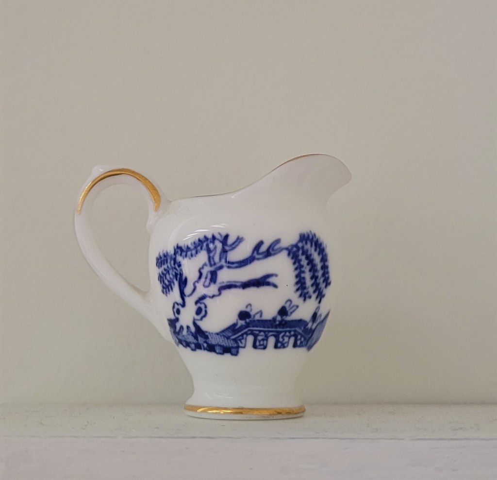
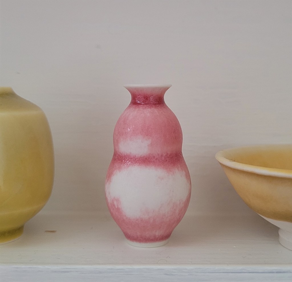
Amy: Miniature shelf unit and contents

It’s very sweet, and one of the newer things in the house. It’s very different. Although there are lots of pots, there aren’t many tiny pots. My favourites are the tiny blue-and-white jug and the little pink one.
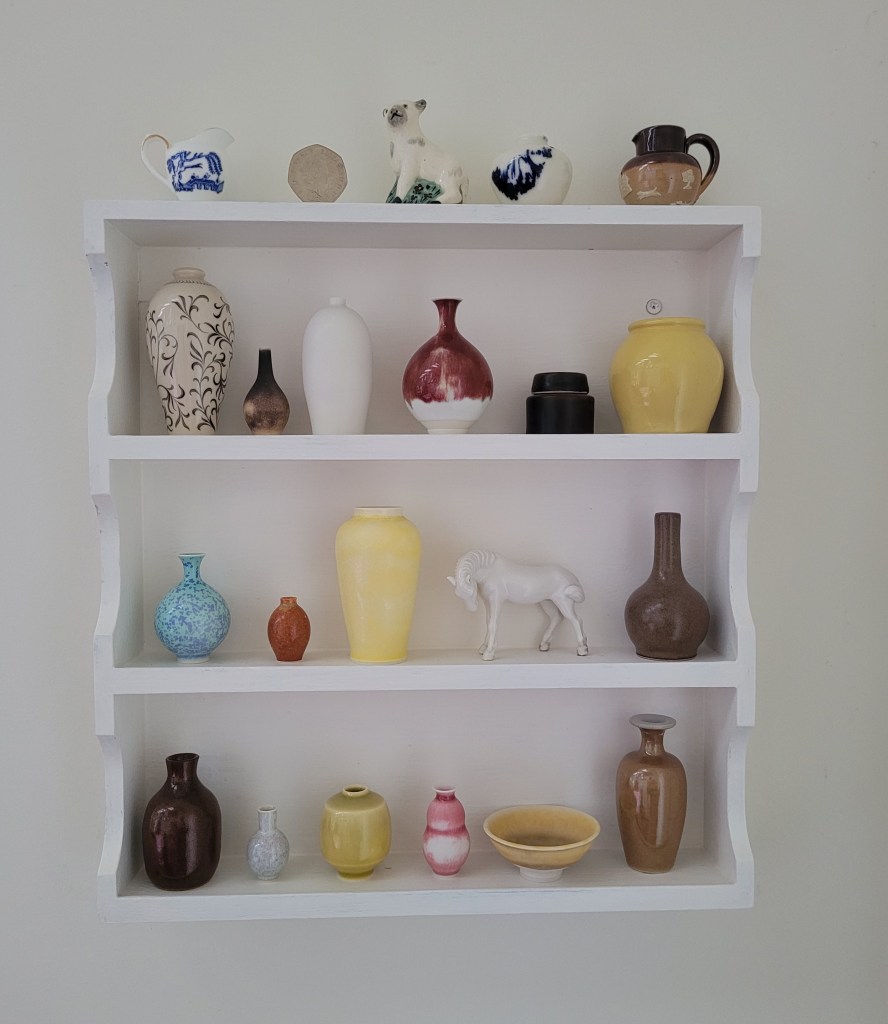
I am quite proud of this small installation, which was a project undertaken during the first Covid lockdown in the spring of 2020 and is one of a very few such practical exercises which I have ever completed satisfactorily. The shelf unit is a re-purposed and/or upcycled 1970s teak spice rack, found in a charity shop, which I sanded down, covered with several coats of matt white paint, and then affixed to a wall in our dining room.
Whereas I tend to buy ceramics in all shapes and sizes – including some pots which are very large indeed – Frances’s taste is mainly for miniatures. She has become especially fond in recent years of the tiny hand-thrown vessels made by Yuta Segawa, a young potter born in Japan who now lives in London (https://www.yutasegawa.com/), and has collected several of his pieces. These, together with a number of other ceramic miniatures of all kinds, were looking for a home, and the teak spice rack, which for various technical reasons I deemed unsuited for holding spices, presented an ideal vehicle for their display.
In addition to the Segawa pieces, you can see tiny pots from China, Japan, Staffordshire, Sweden, Lambeth and Scotland. The lamb is a little Staffordshire pepperpot, and the horse is dehua porcelain from China. The fifty pence piece is there to show scale.
Amy’s choices: the blue-and-white jug is a piece from a Coalport miniature tea-set, and the little pink one is by Yuta Segawa.
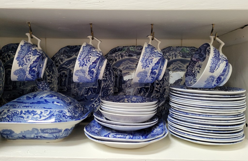
Celia: Plate in Spode’s Blue Italian pattern

It’s a china plate. I like it because you have cups of tea on it. I chose it because I like the design and I’m used to it. I like the detail – it has lots of tiny things.
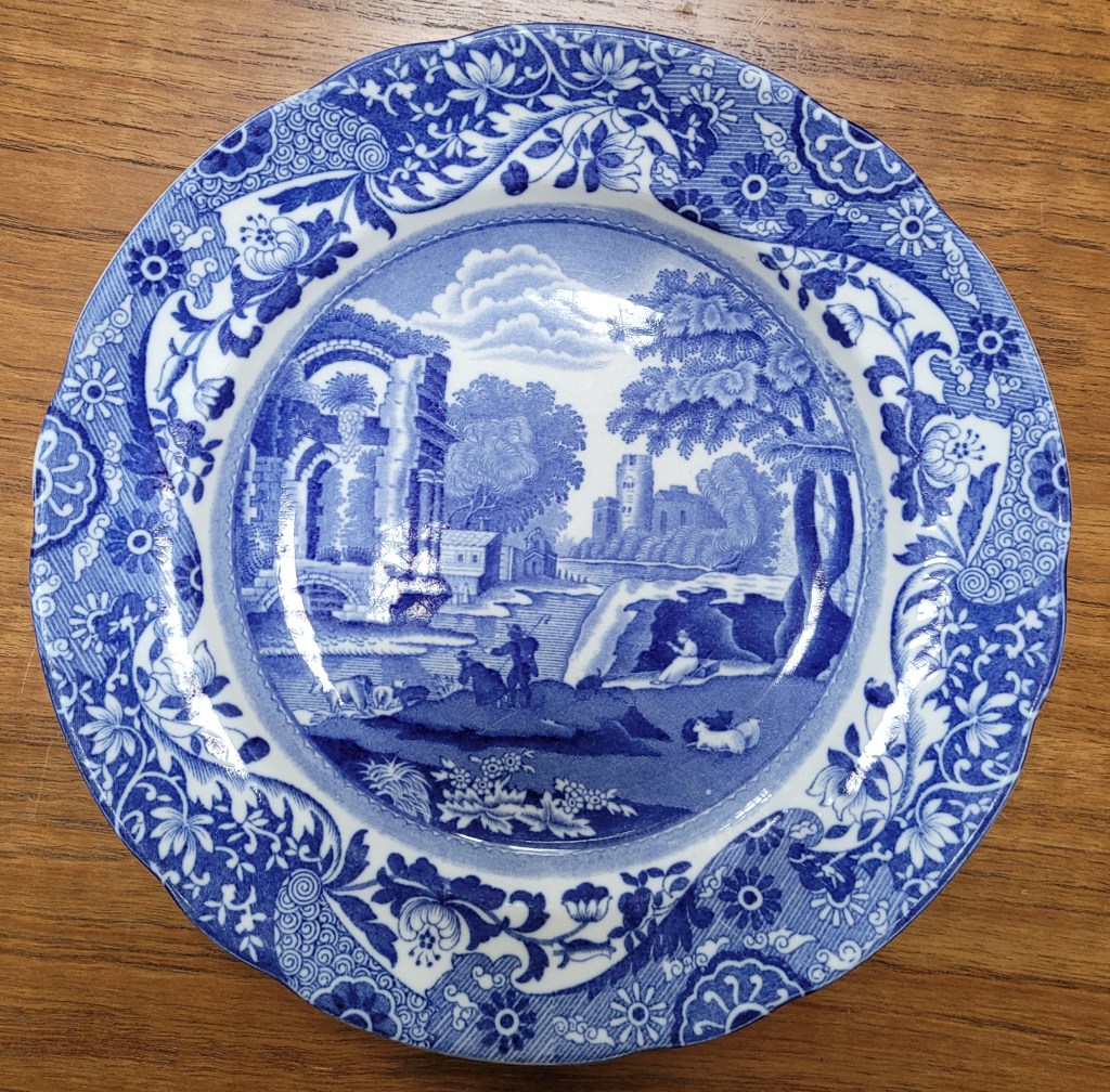
Celia visits our house at least once per week, and she has never been here without eating something. For perhaps the first three years of her life she was served her food in plastic vessels, but during the subsequent five years she has eaten from our Spode’s Blue Italian tableware perhaps 250 times or more (except on Christmas Day when we get the Wedgwood out). Little wonder, then, that she should have studied the intricate neoclassical design carefully and that she should choose a plate from our set as one of her selections.
When I talk about our “set” of tableware, I use the term loosely. It isn’t a set, having been assembled about a decade ago from several bulk auction purchases which all came up around the same time. If you buy second-hand crockery in large mixed lots you tend to end up with the items that other unknown households have themselves collected over time, and it’s difficult to control quantities. For example, it’s a demonstrable fact that in the course of domestic existence more teacups get broken than plates, so in order to assemble a dozen second-hand cups and saucers, you might find yourself buying an auction lot with more than 12 plates alongside them. At the last count, our kitchen cupboard and dining room dresser held around 55 tea plates in several sizes. There are 19 dinner plates, and around 30 small pudding or cereal bowls, but try as we might, we have difficulty procuring large soup plates and only have eight (including one cracked and one discoloured).
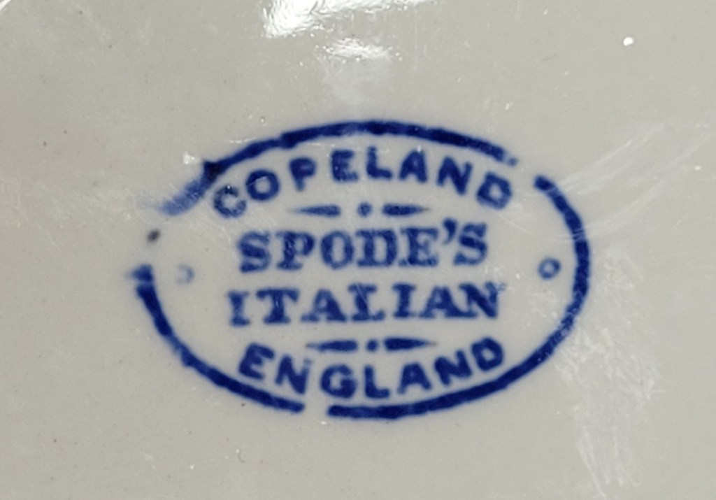
Spode’s Blue Italian transferware has been in continuous production since 1816 and has throughout that time been very popular. It is hardwearing, dishwasher-proof and never seems to go out of fashion. So there’s plenty of it about and we know we can always buy more if needed. For most of the 20th century, pieces were marked with an oval backstamp, which was replaced in 1970 with a more modern design. Almost all of our ware has the oval stamp, which means that it’s over half a century old. Frances and I don’t break much crockery and (except for soup plates) we expect to be able to supply all our daily tableware needs from existing stocks until the time comes when we have to be fed through tubes.
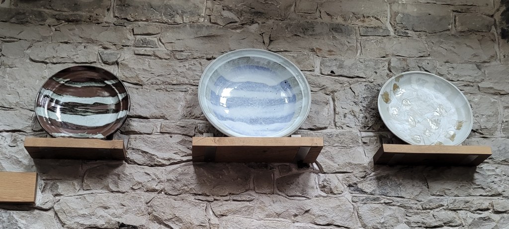
Amy: Stoneware charger by Maggie Zerafa
For my entire life I’ve thought it was such a different pot. It’s the real-looking, lifelike image, the interesting detail. I prefer it to the two others.
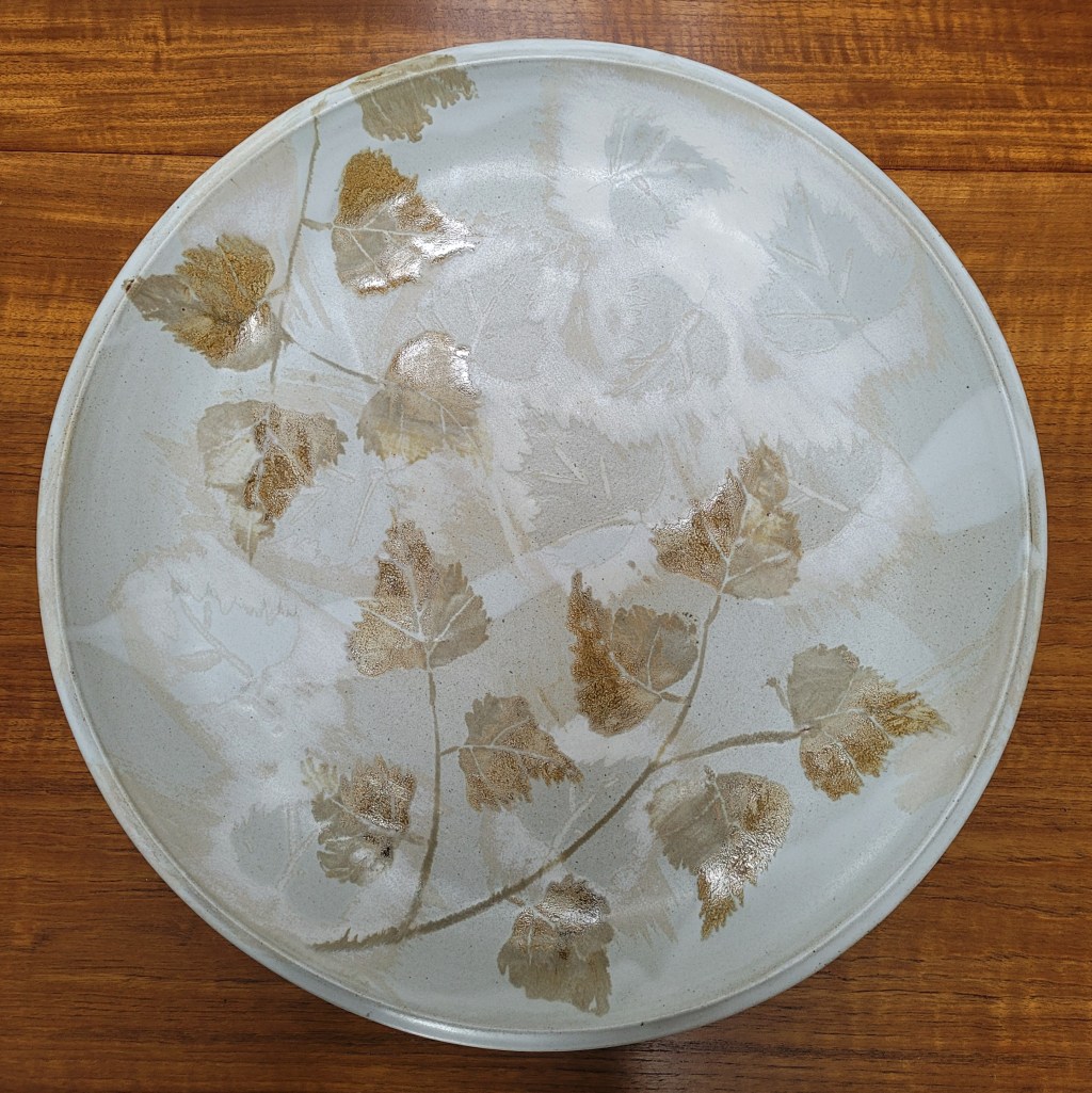
This big heavy stoneware charger some 48cms (19 inches) in diameter was made by Maggie Zerafa, an Australian potter who studied ceramics in Japan and now lives and works at Armadale on the Isle of Skye in the Scottish Hebrides. It was bought several years ago from an exhibition at the Scottish Gallery in Edinburgh.
The sycamore leaf decoration is exceptionally naturalistic and I have absolutely no conception of what techniques the potter used to achieve this appearance. Her website at http://www.maggiezerafa.com/ shows that her latest work is in a very different style.
The charger sits on a specially-made bracket shelf high on the wall of our dining room. Amy habitually sits for meals on the side of the table facing this wall, so she must have spent many hours looking at it while eating with us. I can easily see what attracted her to this object, but some might be surprised that its rather porridgey colour scheme should appeal to a young person.
To the left of the Zerafa charger facing Amy’s seat at the table are shelves displaying the two others to which she refers, and which she doesn’t like so much. They were both made by a much better-known English potter: William Plumptre, who trained in Japan under the legendary Tatsuzo Shimaoka (1919-2007), the second Japanese potter to be designated by the Japanese government as a Living National Treasure.
Celia: Upholstered stool
I like how you like stools and tables and rugs [in the house] and this is like a stool and a table and a rug [all in one].
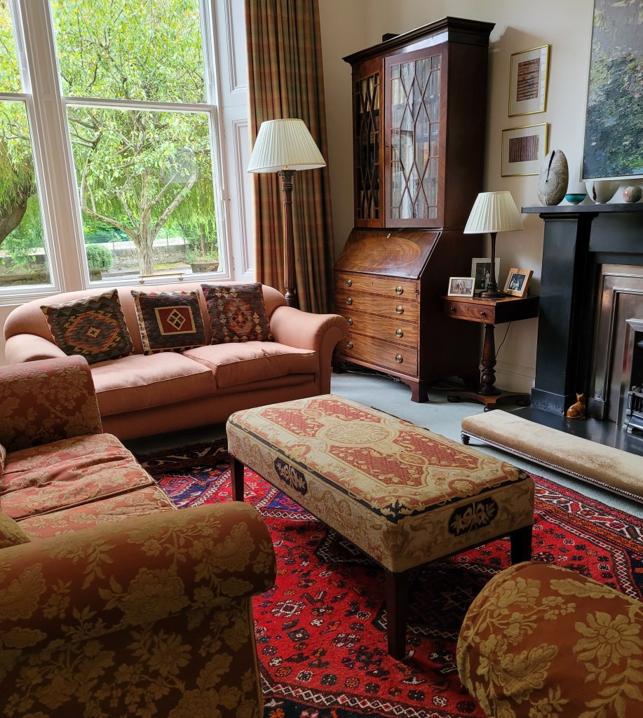
There isn’t much to say about this modern upholstered stool which takes the place of a coffee table between three sofas arranged in a U-shape in our living room. It was bought in an almost-new state from an auction (as you might expect) and had a maker’s label on the underside which has now unfortunately been lost. I believe the manufacturer was in East Lothian but can’t recall the details.
Someone much more polite than us came to visit and identified it as a conversation stool and it does indeed appear that this is the correct term for an upholstered bench (see https://www.christies.com/en/lot/lot-5794267). In our house, it is used sometimes as a seat for conversation, often as a vehicle for holding trays of hot beverages and scones, and regularly as a piece of gymnastic apparatus for children to jump hysterically up and down on.
The fabric with which the stool is covered appears to be hand-made wool cross-stitch embroidery. Celia is entirely correct and impressively perceptive when she describes the object as a stool and a table and a rug all in one.
Amy: Glengairn triptych by Alison King
Even though there’s no pattern, I like the beautiful images. I like the contrast between the fabric and the painting.
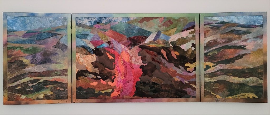
Alison King, the textile artist who made this wonderful triptych, is a regular reader of this blog and will be very pleased with Amy’s choice. It is not an entirely abstract work but a landscape depicting a specific location: in Glengairn in western Aberdeenshire in the Scottish Highlands, where Alison has a cottage and studio.
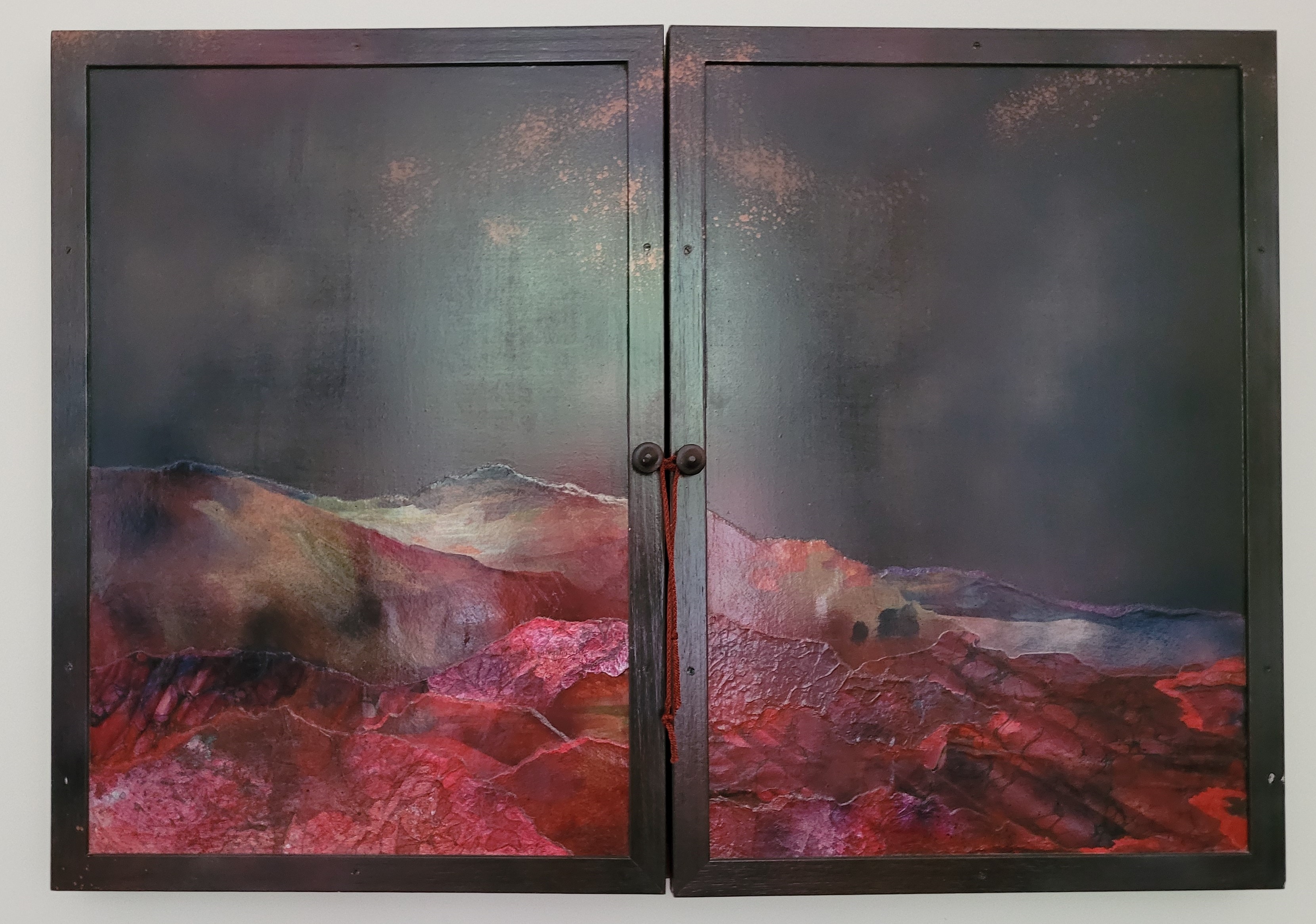 The centre panel of the triptych combines textile painting, appliqué, quilting and embroidery; the hinged side panels are painted on canvas. When opened, the piece is 2 metres wide and splendidly dominates one wall of our living room. When closed, the outer doors show a painted night landscape. The triptych faces a west-facing window and we worry about fading of the delicate fabrics, so the doors are usually kept closed except when we have guests.
Alison is a well-known Edinburgh-based artist with works in many public and private collections, and you can read about her here: https://www.textileartist.org/alison-king/. She’s also our neighbour (we live at number 6 and she lives at number 2), and Ali and her redoubtable husband Dougie are our very close friends. Frances bought the triptych from Alison and gave it to me as my 70th birthday present. I couldn’t have been more delighted.
Celia: Paris porcelain lamp
I like the flowers and the shininess and it’s like a pot and a lamp. I just love it.
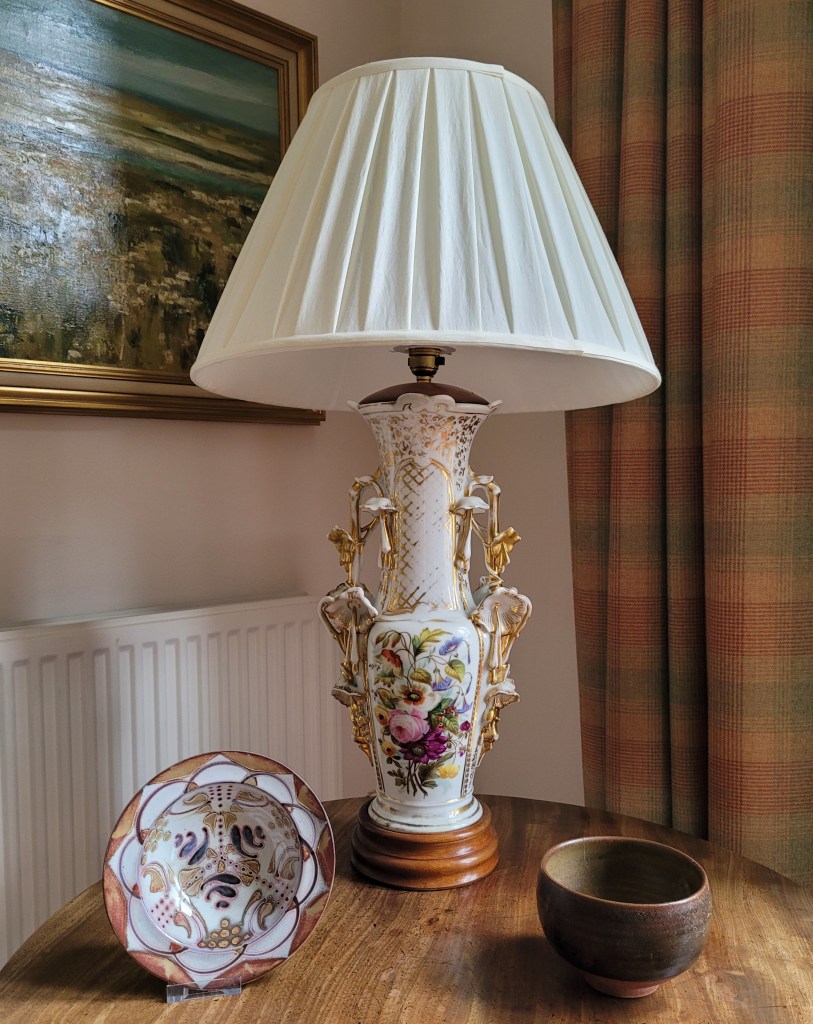
This object caused some controversy in the household when I brought it home from an auction sale a couple of years ago. Having spent many years carefully curating the ceramic display in our living room to accentuate qualities of minimalism and brownness, what on earth was I trying to do by introducing a flouncy, curlicued, flower-encrusted, painted and gilded monstrosity into its midst?
Aha, I answered, I’m trying to mix it up. After all, we like our combination of modern pottery and abstract art with antique mahogany and traditional soft furnishings, so why not put in a bit of ridiculously over-the-top rococo-revival china as a contrast to the coolness and occasional downright brutalism of the pots which surround it? Frances was acquiescent but far from convinced. I’m hoping that Celia’s seal of approval will make it slightly more acceptable in her eyes.
Before its conversion to a table lamp, the object started out in life as a vase, probably one of a pair. It’s chipped and cracked and damaged but (as we say in the trade) it displays well. It was probably made in France some time in the second half of the 19th century, but doesn’t bear a maker’s mark on the base. This type of highly decorated shiny white ware might have been made at any one of a number of minor factories, and is usually categorised under the generic description of Paris Porcelain.
Amy: Italian maiolica salt
I chose it for the colour and the incredible detail. It’s a bit strange but it captures my eye – strange because it’s men holding something up. It looks very old.
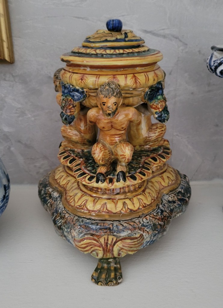
Yes, it is indeed a strange and eye-catching object, one of a near pair which live on the mantelpiece in our bathroom. It was made in Italy in the traditional tin-glazed earthenware known as maiolica and is designed in the manner of the second half of the sixteenth century. Maiolica ware was made in many local centres throughout Italy, and this example is in the colourful Urbino style.
But is it a genuine Renaissance-period piece? I don’t think so. This type of maiolica has remained continuously in production for more than 500 years, and experts can immediately tell if a piece is early or a reproduction. I am no expert, but I don’t think this item shows the characteristics of an early piece, and suggest it was made perhaps a mere century ago or slightly more.
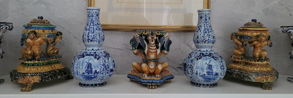
It is easy to see what attracted Amy: the strong colours and the bizarre composition, with three bearded, cloven-hoofed satyrs kneeling on a trefoil plinth and supporting a small lidded vessel on their shoulders. The container is probably for use as a salt cellar, to be used as a decorative table centre. Or it might perhaps be an inkwell, to be placed upon a scholar’s desk. I’m not certain which.
Near it on the bathroom mantelpiece is the object’s almost identical pair, and between the two there is another similar but damaged piece, in which the three figures supporting a central shallow dish are not satyrs but grotesque lion-headed (or dog-headed) winged beasts tied together with a blue ceramic ribbon. This one is definitely a salt cellar and I think there’s a good possibility that it is a genuine period piece from the 16th century.
Celia: Painting by Perpetua Pope
I like it because it’s really pretty and quite a big picture and someone actually painted it. It’s not like one place but seems to be going backwards. It’s just phenomenal.
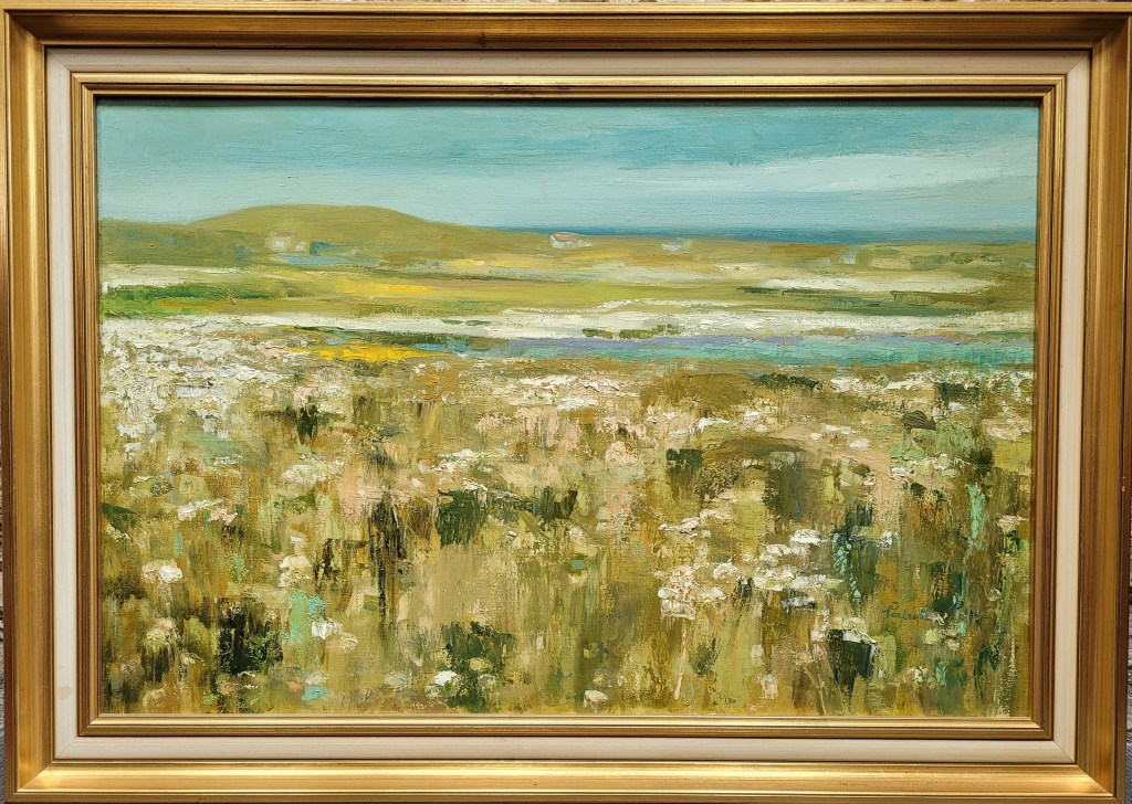
This painting in acrylic on canvas is by the well-known Scottish artist Perpetua Pope (1916-2013). The title is Eoligarry V, the fifth picture of a series painted by the artist on a visit to Eoligarry Beach at the north end of the small Island of Barra in the Outer Hebrides. From a low viewpoint the artist looks across the machair (the low-lying fertile seaside plain characteristic of the islands) to the sea and the gentle hills on the opposite side of the bay and the sky beyond.
This picture has hung on our walls for more than 40 years and was one of the first pieces of original artwork that Frances and I bought. We had fallen for Perpetua Pope’s paintings at an exhibition in Edinburgh, but couldn’t afford to buy one – but then shortly afterwards this example came up at an auction and we secured it at a very much lower price than buying from the exhibition. Inspired by the picture we went on holiday to Barra the following year and can confirm first-hand that the artist has caught the look of Eoligarry Bay very accurately.
Celia’s comment that it’s not like one place but seems to be going backwards is of course her way of describing perspective. If only professional art critics could be so precise and perceptive in their writings!
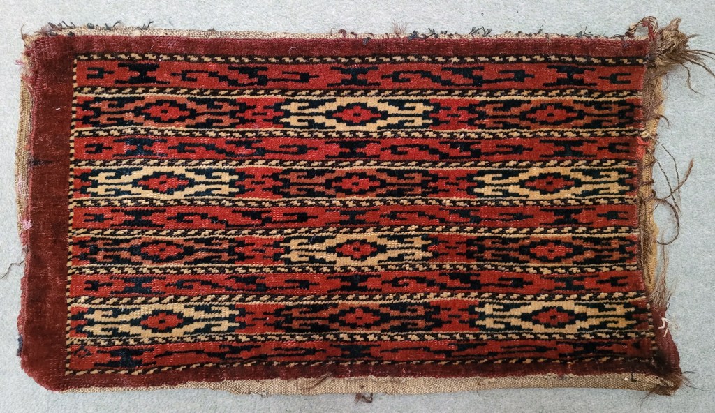
Amy: Yomut igsalyk
It is simple compared to the other rugs but the pattern is very nice.
Visitors to our house are often befuddled to find that our bland celadon-green fitted carpets are mostly covered with dozens and dozens of colourful rugs of all sizes. The majority of these are either Turkmen or Baluch pieces, woven by nomadic or locally settled craftswomen in Central Asia, Iran and Afghanistan. I won’t buy modern rugs and can’t afford to buy top-quality antique rugs: as a result, most of my pieces are worn and threadbare and faded and well past middle age – not unlike their owner. I like it that way, but my taste in rugs is not everyone’s taste.
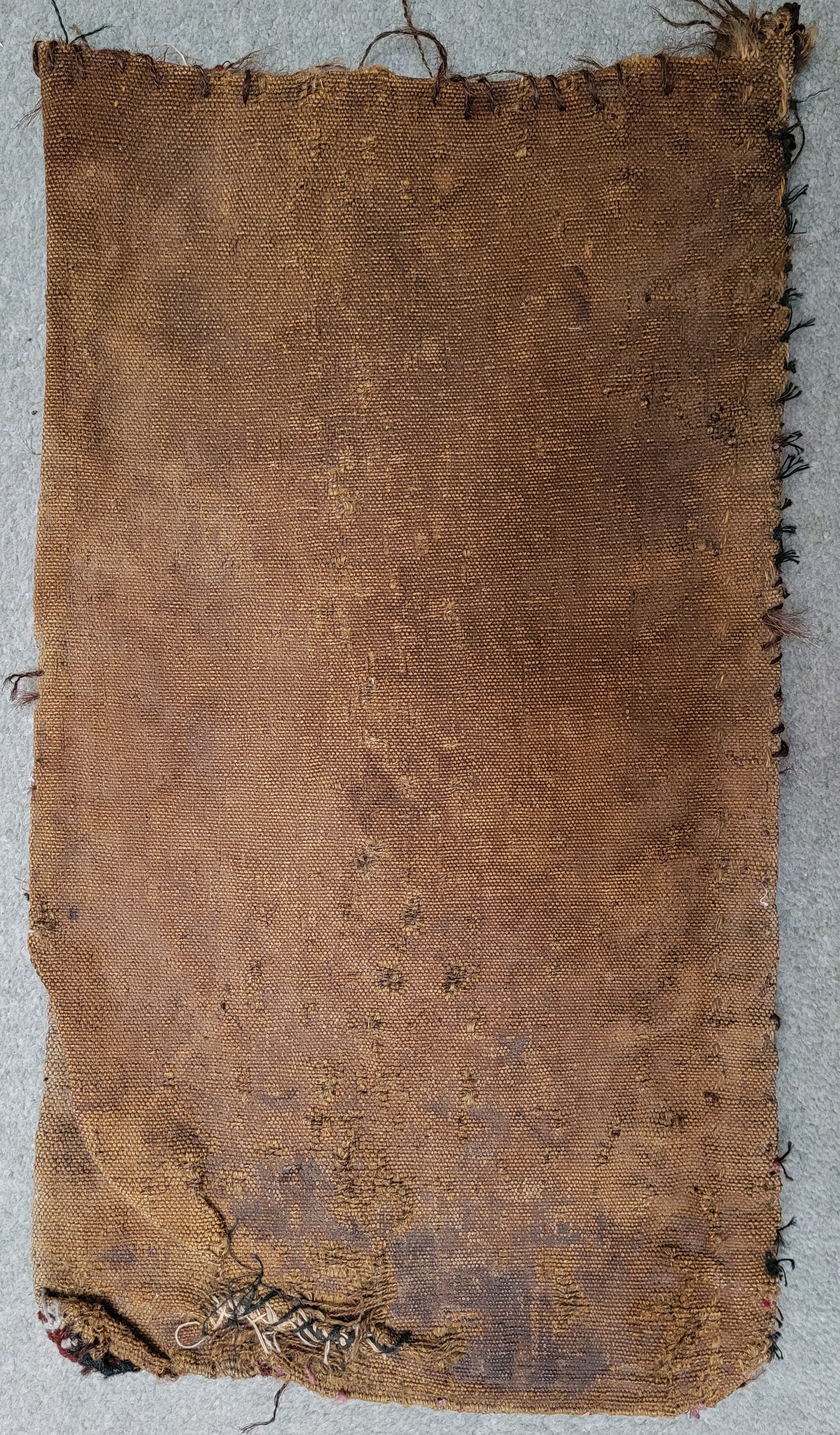 Amy’s discerning choice is one of the smallest rugs in the collection, and also one of the most interesting. It is just 50 cms long and 28 cms wide and it isn’t actually a rug at all: it is a bag, with a plain canvas back.
The object is called an igsalyk or spindle bag, used by nomadic tribespeople to store small pieces of rug-making equipment on their journeys by camel around the part of Central Asia now known as Turkmenistan. As I tried to explain in a previous blog post (https://random-treasure.com/2017/07/13/turkmen-guls/), the Turkmen people are divided into five main clans or tribes, each with its own traditional patterns and motifs which they weave into their rugs. This igsalyk was made by a member of the Yomud tribe probably in the late 19th century, and it is one of the few rugs in my collection which would be coveted by serious collectors.
Celia: Book – Random Treasure
I chose it because it’s written by you and it’s really good and you have lots of pots but everything is in it.
Well, I couldn’t leave this choice out, could I? At 8 years old, Celia’s reading is coming along well, but she’s not yet quite ready to read my book – in which respect she resembles many other potential readers, which explains the very large number of unsold remaindered copies stored in my attic.
Although she hasn’t read the book, she knows how much effort I put into writing it, and that it contains the stories of many of my ceramic pieces and innumerable other objects assembled during more than 60 years as a collector of random treasure: coins, books, pictures, glass, stamps, lamps, and a very remarkable wooden statue. She knows the book is really good because I and other members of my ever-loyal family have told her so on many occasions.
And she knows, of course, that the book has a lot of me in it – and I take it as a huge compliment that she has selected Grandpa’s modest (or immodest) volume as one of her choices.
I think this has been quite an interesting exercise. My beloved grand-daughters Amy and Celia are not unlike my three other grandchildren Samuel (12), Eliza (9) and Oscar (6), and probably not unlike other urban digital children in the same age ranges. For the most part they are interested in what other children are interested in: chatting, playing with toys, eating, laughing, niggling, bouncing around in an undisciplined fashion, and watching utter bilge on Youtube. In amongst these all-consuming activities, you might think that they would have neither time nor inclination to notice brownish, boring stuff in Granny and Grandpa’s brownish, boring house.
But they do. They look at the stuff and select preferences. They think about their choices and form strong opinions. And they can explicate and defend those choices in clearer, more succinct terms than are available to highly-trained critics, curators and dealers. I’m full of admiration for them.

I thoroughly enjoyed reading this.
It’s comforting to know that there are other families like my own out there during these ‘interesting times’.
Sometimes it seems that the world has become full of horrible people with strident voices and the kind of normality that I cherish has been lost for ever.
Family, old things and their stories, art, nature and my two collies are what I find precious, so it’s just nice to know that other people still think like that too.
LikeLiked by 1 person
Thank you Jocelyn. Pleased you enjoyed the piece. Yes, there are still lots and lots of ordinary families out there, just struggling on with their lives and not being too troublesome. But of course if you’re not troublesome, you’re also not newsworthy, so you don’t hear so much about them 🙂.
LikeLike
True.
LikeLike
A treat Roger. A charming conceit, charming girls, charming choices. Potteryness is perfectly apposite – a ready-made title for your next book …
LikeLike
Thank you Bob. Pleased you enjoyed it but it sounds worryingly charming. Wonder if I’m losing my edge? Or perhaps I never had an edge to lose? 🤔
LikeLike
Great choices and explanations, which often focused on two or more aspects/uses of the same piece (William ‘beautiful/useful’ Morris would be proud. They obviously have excellent collector genes …
LikeLike
Loved your closing observations of your two Edinburgh granddaughters, youngsters can be surprisingly astute! Dougie
LikeLike