
 I haven’t written often in this blog about books. But if you ask me what type of object I have collected most persistently and prolifically over my lifetime, then books take the number one spot. In my house, I have several sculptures, a few dozen rugs, scores of pictures, hundreds of pots, but thousands of books. In the room where I write this blog, there are around 10 metres of shelving for ceramics, but nearly 43 metres of bookshelving, with a further 3 metres of books lying unshelved in piles on the floor. I know this because I just measured. And then there’s the rest of the house…
They aren’t only my books. Frances has been almost as avid a bookbuyer as me, and in addition most of her late father’s fine collection of Scottish books is also on our shelves.
Mostly, we buy books for their contents, for reading or for reference. For this reason, we buy many fewer books nowadays than previously, because at least half of our current reading matter doesn’t have a physical substance but arrives through the miracle of wifi into our Kindle e-readers. We find Kindles useful to help prevent further book congestion. They are lightweight and highly portable, and they don’t rustle when someone is trying to get to sleep, but they are also slightly inflexible and annoying: okay for page-turner novels, but difficult to manage for long books with multiple characters or illustrations or maps.
Similarly, our need to accumulate weighty reference books has enormously reduced since so much research material has become available online.
However, Kindles and computers don’t provide one important element of the book – its physical presence. Books aren’t simply neutral, passive vehicles for the words that they contain. They are objects in themselves, and that’s what this blog piece is about: the Book as Object. The Book as Artefact.
In most cases a book is nothing but a book. Buy a Jack Reacher novel, read it, give it away to a charity shop and buy another. But in some cases the book comprises much more than its contents. It might be old, or rare, or be a first edition, or have special provenance, or a fine binding, or any combination of the above. You know the sort of thing – a Shakespeare first folio, a first edition of Darwin’s Origin of Species or of Newton’s Principia. These are incredibly rare and special objects in themselves, regardless of the particular meaning or significance of the words inside them.


 I regret that I don’t own a copy of any of the above-named volumes, and if I did, I couldn’t afford to keep it for long. The level of temperature and humidity control, security and insurance required in order to keep it safe would be well beyond my means, and so I’d move it on to a more appropriate new owner, with regret but without qualms. But I do own a few very special books, two of which I now present for your inspection. They are both versions of the Book of Common Prayer, and before I go on to write about them in detail, I should probably try to explain to you why it is that an agnostic Jew should be so proud to possess a considerable acreage of Christian praise.
The story is related in my own book Random Treasure. I’ve tried in this blog not to recycle content from the book but in this case, I can’t think of a better way to express myself. So here’s a quotation from my book, presented either (a) in the hope that you will think this snippet so interesting that you’ll follow this link and buy the book, or (b) in the expectation that you’ll never read the book so it doesn’t matter a jot if I plagiarise myself unashamedly.
Here’s what I wrote on Page 51 about my teenage years living with my parents in Charing Cross Road in Central London, at that time the unquestioned UK epicentre for the second-hand and antiquarian book trade:
“I don’t know what other (normal?) boys of my age were spending their pocket money on, but I was spending all of mine – and then some – on antiquarian books. My tastes in books are marginally more sophisticated now than they were half a century ago, but back then, my two criteria for buying books were that they must be old and cheap.
It’s an incontrovertible fact that if you focus on buying books solely on the basis that they must be the oldest and cheapest you can find, you end up owning a large number of religious books, particularly bibles and prayer books. This is partly because there are many more of them than there are of other early books, partly because there is less demand except for those of the best quality and in the best condition, and partly because so many of them are in very poor condition resulting from hundreds of years of frequent handling.
I still own most of the religious books that I bought from the cheap racks outside the second-hand bookshops of Charing Cross Road, and for the most part I’m still very glad that I do, because they are interesting and beautiful artefacts.”
Having told you why I own a large number of religious books, I should tell you next about the background to the Book of Common Prayer. It’s the compendium of the principal prayers of the Anglican church, and the original source for much of the liturgy still used in many branches of the Christian church throughout the English-speaking world. First compiled in 1549 it has been through many revisions, and the 1662 version is still the official prayer book of the Church of England.
 From time to time the Book of Common Prayer has been a highly controversial document. In 1637, attempts to introduce its use in worship in Scotland led to serious rioting in Edinburgh. A market-trader called Jenny Geddes hurled a stool at the head of the minister in St Giles’ Cathedral, and the resulting political and religious crisis led to the English Civil War, culminating in the execution of King Charles I, the establishment of the Commonwealth, and the Protectorate of Oliver Cromwell.
The magnificent and robust language used in the Book of Common Prayer has also had a very strong literary influence.
“Together with the King James Version of the Bible and the works of Shakespeare, the Book of Common Prayer has been one of the three fundamental underpinnings of modern English. As it has been in regular use for centuries, many phrases from its services have passed into everyday English, either as deliberate quotations or as unconscious borrowings.”[1]
 Every English speaker, of whatever religious persuasion, will be able to quote chunks of prose from the Book of Common Prayer, often without even knowing how they got the knowledge or where it comes from.
A controversial, powerful and influential book, but also a very popular and potentially profitable one, since vast numbers of copies have been required to be printed and sold in order to maintain supplies to churches and private individuals over several centuries and multiple countries. As a result, the Book has been produced in countless editions, most of which are very ordinary and unremarkable objects well suited to the hard wear involved in daily or weekly use for worship in church or at home.
But a few editions of the Book of Common Prayer are very special objects, examples of exceptionally high quality in printing and design, and important landmarks in the development of the printed book. I’m lucky enough to own examples of two of these extraordinary versions, both bought for a few shillings in London bookshops. When I use the word “shillings”, I’m talking about the British currency as it was before decimalisation in February 1971. A shilling was equivalent to twelve pence (old style) or five pence (new style) – but for our present purposes, I’m trying to get across that I bought these volumes around half a century ago and paid what was a trifling amount of money even then.
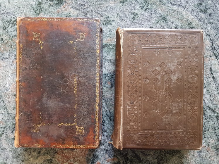 The books are John Baskerville’s Book of Common Prayer of 1760, and Owen Jones’s Book of Common Prayer of 1845 (1850 reprint).
John Baskerville

John Baskerville (1707-1775) was a Birmingham businessman, printer and designer. From humble beginnings, he set himself up as a writing-master, then as a carver of lettering on gravestones, and then started a business producing japanned decoration on metalwork in imitation of Eastern lacquerware. The japanning works proved very successful, and enabled Baskerville to focus on his obsession with lettering and printing. He designed and made his own eponymous typeface, manufactured innovative printing presses, and experimented to develop the best quality inks and papers. He started his printing career in 1757 with an edition of Virgil and went on to produce some of the most beautiful books ever printed in English.
Although a confirmed atheist, Baskerville didn’t let this fact prevent him from publishing editions of the Book of Common Prayer (1760-1762) and the Bible (1763).
“The 1662 Book of Common Prayer … has gone through literally hundreds of printings. Of these many printings, only a few stand out, chief among which are a series done by John Baskerville between 1760 and 1762. Baskerville was one of the giants of English typography, making a number of innovations, including the Baskerville typeface still in use today. His typefaces were finely constructed, his designs simple, and spare, and made great use of white space. He also pioneered in developing fine papers for printing.”[2]
 Unfortunately the Common Prayer book wasn’t a commercial success, because he lavished so much care and attention on the development of the typeface, the design and layout of every page, and the quality of paper, ink and printing. The first printing was priced much too cheaply at six shillings and sixpence (6/6), but this was very soon altered to 7/6 and in the 1762 printing to 8/6.
 Batches of Baskerville’s Common Prayer Book were published in three editions and many different variants. If you’re interested (doubtful), you can read a very detailed bibliography which provides in the minutest detail an account of all the variations [3]. My copy is from Group 1 (Gaskell 12), and is from the very first edition showing the price as “Six Shillings and Six Pence, unbound”. This first edition came in two varieties, one without a printed border to the pages, and one with Baskerville’s “lozenge and star” border around the text on every page.
 My copy is from the second of these two variants, and it also includes the section of “occasional prayers” near the end, which was printed in only part of the edition. This section has various prayers for use on notable occasions including a form of praise for the Fifth of November to commemorate the anniversary of the Gunpowder Plot of 1605.
Baskerville didn’t bind his books in-house, but is thought to have had a business relationship with a local bindery, and my copy is in its original brown leather binding with the remnants of gold tooling. When I bought it the binding wasn’t in the best condition and I had it lightly repaired and conserved by a professional bookbinder, who made a replacement COMMON PRAYER leather label for the spine. The second label on the spine, which has the single word PRIORY, is a mystery yet to be solved.
The book is also bound using Baskerville’s very distinctive marbled endpapers (much academic study has been conducted even on his techniques for making this paper [4]), and it has marbled edges.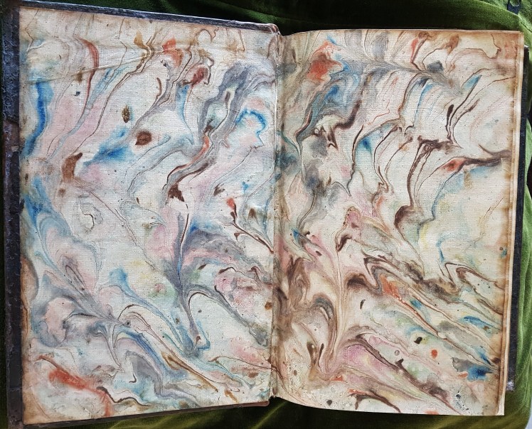
So all-in-all, my copy of Baskerville’s Prayer Book is very early, very original and quite scarce. This doesn’t, of course, make it enormously valuable – after all it’s only a Baskerville Book of Common Prayer and not a Shakespeare First Folio or a Gutenburg Bible.
So what is it that’s so attractive about a book which is really quite notable for its plainness and whose contents frankly don’t interest me all that much? It’s a difficult question to answer but I think the best term to describe it is cleanness. The type is sharp and clear and superbly laid out. The paper is thick and bright and white and has very little of the characteristic discolouration and foxing of other eighteenth century books. You can tell that it isn’t simply a production of a jobbing printer whose aim was to crowd as many words as possible into a page, and to get the work done quickly and cheaply. Instead, it’s a carefully designed, meticulously detailed and very expensively produced labour of love. Little wonder that for Baskerville the Book of Common Prayer was a financial flop even after he started hiking the price within weeks of printing his first edition.
Owen Jones

Owen Jones (1809-1874) was a London-born businessman, architect and designer. Although he called himself an architect, he didn’t design very many buildings, of which few were actually built and fewer still have survived until today. He is chiefly known as a teacher and theorist of design, and as one of the most important and influential designers of the nineteenth century.
“19th-century Britain was dominated by historical revivals such as Neoclassicism and the Gothic Revival. These design movements were riddled with religious and social connotations. Instead, Owen Jones sought a modern style with none of this cultural baggage. Setting out to identify the common principles behind the best examples of historical ornament, he formulated a design language that was suitable for the modern world, one which could be applied equally to wallpapers, textiles, furniture, metalwork and interiors.” [5]
And Jones’s style could also be applied to books. Dissatisfied with colour printing standards then available, he became interested in the fairly new technique of chromolithography, and began to produce books illustrated in colour to a quality standard not seen since the illuminated manuscripts of the pre-printing era. Needless to say, making these books was at first grotesquely expensive, and the production of his first masterpiece Plans, Elevations, Sections and Details of the Alhambra (1842-1845) was financed from his own resources.

Between the Alhambra and the publication of the great design sourcebook for which he is best known, The Grammar of Ornament (1856), Jones had a busy time. In addition to directing the interior design of the Crystal Palace for the Great Exhibition of 1851, he found time to collaborate with publishers and printers to produce popular items such as illustrated gift books, calendars, playing cards, and other household ephemera. And in 1845, together with the publisher John Murray and the printers Henry and Ernest Vizetelly, he issued his version of the Book of Common Prayer.
I can find no detailed bibliography for the work of Owen Jones such as that which exists for John Baskerville. Most academic books and articles focus on the Alhambra and especially The Grammar of Ornament to the virtual exclusion of all of his other publications. All I know about the publication of the Prayer Book is that it was reprinted in 1850 and then again in 1863. Owen Jones
“contributed designs for many publications during his career, but his Book of Common Prayer … is among the best. It is a very elaborate production, using multicoloured ink with each of the eight sections having a separate title-page. The text is printed in black alternating with paragraphs in colour. Jones varies each section with floral borders or patterns based on Celtic motifs and initial letters adapted from medieval manuscripts. It is a stunning production, totally unlike the relatively restrained Prayer Books of the previous centuries, and points to the direction that books in general were to follow in the Victorian Age.” [6]
 My copy of Jones’s Prayer Book is an example of the 1850 reprint. Neither especially rare or especially valuable, it is in its rather battered original binding by the bookbinders Remnant and Edmonds of London. The dull brown blind-stamped cloth binding doesn’t prepare you for the riot of colour and ornamentation to be found inside. Indeed Jones recognised that some of his earlier illustrated books were let down by their covers, and it is quite usual to find copies of the Prayer Book re-bound much more lavishly to match the interior. “Almost every one of the over 500 pages is decorated with wood-engraved borders in a wide variety of styles, printed in black, blue and red together or in single colors including green, lilac, blue, red, and brown.” [7] There are eight illuminated title pages, four full-page woodcut plates, and 37 wood engravings within the text.
 And what is it that I find so attractive about the vibrant Owen Jones Book of Common Prayer, so drastically different from the austere, stark version produced by John Baskerville? I think it’s the sheer joyousness of it, with colour and intricate ornamentation on every page. My interest in the content is limited, so I’m not in a position to judge whether or not the exuberant decoration is appropriate to the textual substance of each page. But I imagine that when this volume is in use for its purpose as a prayer book, it has a huge advantage over most other printed editions in continually providing something interesting to look at in order to relieve the inevitable tedium of some of its liturgical content.
Finally, the question arises of which one I prefer of these two very special books? Apologies, but it’s a question that I can’t answer. I have never been much good at deciding which of anything is my favourite. To be honest, I don’t see the point. So I’ll turn the question around and ask you instead. Here are some pages for you to compare. Which book – or perhaps I should say which artefact – do you like better?
References
[1] https://en.wikipedia.org/wiki/Book_of_Common_Prayer
[2] http://justus.anglican.org/resources/bcp/1662/baskerville.htm
[3] Gaskell, Philip, John Baskerville: a bibliography, Cambridge University Press, 1959, pages 30-32.
[4] https://blogs.reading.ac.uk/special-collections/2019/05/baskervilles-marbled-papers/
[5] https://www.vam.ac.uk/articles/owen-jones-and-the-grammar-of-ornament
[6] Charles Hefling, Cynthia L Shattuck, The Oxford Guide to the Book of Common Prayer: a Worldwide Survey, New York: Oxford University Press, 2006

A very enjoyable and informative read, thanks. But a hard choice between the two – I love the colour on the Jones, but not his rather Pugin-esque heading type-face, so Baskerville has it on the typeface and general elegance. The jury is still out …
On ‘book as object/artefact’ and a thing of beauty in itself, I don’t know if you’ve read ‘In Praise of Shadows’, a slender volume with a lovely passage (or perhaps even a chapter) on how the Japanese view books and the whole reading experience they provide.
LikeLike
Thank you Anne. Pleased you enjoyed it. It seems that Owen Jones wouldn’t have been too happy about his designs being described as Pugin-esque. His 37 principles of design as enunciated in the Grammar of Ornament were partly issued as a modernist reaction against Pugin’s historicism and mediaevalism. Later in the century this led to some sparring between (in the red corner) John Ruskin sticking up for Pugin and hand-making, and (in the blue corner) Dr Christopher Dresser sticking up for Jones and industrial production. It’s probable that I’ve simplified this controversy to an absurd degree because design politics is well outside my comfort zone.
I didn’t know about In Praise of Shadows but have looked it up and will have a shot at reading it.
LikeLike
Probably my atavistic Presbyterian taste for austerity, Roger, but I’d definitely opt for the Baskerville and its crisp unfussy cleanness, the effective use of white space as you say. Those glorious marbled endpapers seem just a subtly calculated touch of unexpected self-indulgence. The Jones for me is almost grotesquely flamboyant and OTT.
I too must take a look at ‘In Praise of Shadows’ – thank you for that recommendation, Anne. I’m quite often struck by the degree to which the form and quality of what I might call a book’s physical presentation can profoundly affect my reaction to its content.
I envy you your books, but even more your spacious bookshelves. My view is that if I can see the backboard I’m not really making full use of the shelves. I reckon the ratio of my yardage of books to shelves must be at least 3 to 2 now, and strangely there’s no sign of movement towards parity – rather the opposite. Since bookshelves lurk in every room in the house except the bathroom it seems all too uncomfortably obvious how the balance must be achieved ….
LikeLike
Thank you Bob. So far, two votes for Baskerville, no votes for Jones. I detect a note of asceticism among my friends.
With regard to our bookshelves, yes, it’s true that you can indeed see narrow clear spaces above some of our books, but these would be more than filled if we attempted to shelve the columns of books currently piled on the floor. I guess, however, that we could find some more space in the house for addtional shelving – but then we’d be faced with the decision whether to fill them with shelves or with pots?
The solution to your own book storage is simple and obvious: shelve the bathroom!
LikeLike