 If I ask you what’s your favourite colour, it is very unlikely that your answer will be orange. In the UK and USA, only 3% of people choose orange. In other countries it’s about 6%, but orange invariably comes in way behind the world’s favourite colours of blue, red, green and, yes, purple[1].
If you ask for my favourite colour, I am strictly a don’t-know. It’s an unanswerable question. I have no favourite because in my opinion all colours are beautiful except when they’re not. If you painted my car pale pink, I wouldn’t like it. But there’s a very unprepossessing city street of ex-council houses near my home which has a long row of huge pink-flowering cherry trees and for a few days each May it becomes a veritable heaven. The lawn in my garden is bright green (that’s because it’s mostly moss), but, much as I like blue and brown (see below) it would be scary if the grass turned blue, and depressing if it turned brown. Any colour might get an equally positive emotional response from me if it’s in the right place in the right circumstances, or it might get a thumbs-down if it isn’t.
Although I profess to finding it impossible to express a preference, you might think differently if you know me. Come into my house and judge for yourself. Look at the objects which surround me. You’ll spot a lot of brown and blue and red, but very little orange. Does that therefore make me a brown/blue/red fan and an enemy of orange? Not at all.
I concede that to outward appearances, there does seem to be a colour bias in the things that I buy and put on display in the house. This is partly a deterministic phenomenon. I like and collect modern studio ceramics, but can mostly afford to buy only out-of-fashion mid-twentieth-century pots which are usually brown. My tastes in ceramics have more recently extended to transfer-decorated production pottery and tin-glazed earthenware, and it happens that many Staffordshire wares are blue-and white, and so are most delftwares. I have come lately to collecting rugs, and get most pleasure from the intricate and idiosyncratic patterns woven by the nomadic Turkmen tribes, which are almost always predominantly red. Most of our furniture is brown mahogany or teak. We eat daily from Spode’s Blue Italian crockery. Our car is blue. In to-day’s freezing weather, my nose is red. Hmmm … yes, perhaps my palette is indeed a little restricted.


I had no inkling of any such unconscious bias in colour preferences until just a few days ago when I suddenly noticed that something was different. Looking side-by-side at a number of highly disparate objects bought in recent months from charity shops and cheap auction rooms, I perceived a subtle change. I’ve gone orange.
This change has no political, religious or sectarian connotations. I’m not feeling any inner promptings to stand on a corner chanting the Hare Krishna mantra, or to join in an Orange march through the streets of Glasgow. Although three-quarters of my ancestors lived in Amsterdam for many generations before decamping to London en masse in the 1850s, I feel no especial allegiance to the ruling Dutch House of Orange.
But, whether due to a shift in my subconscious colour preferences or to pure coincidence, it is a fact that in recent months a notable preponderance of orange-hued objects has entered my collection.


This is not to say that I have never owned anything orange before. A rare and desirable Appliqué Orange Lucerne plate by Clarice Cliff has been with me since being rescued from a tumble-down shed in December 1979 (if you wish to know how I can be so precise about the date, read the whole story in pages 96-100 of my book Random Treasure). There’s an early monochrome orange Carlton Ware bowl which came from a jumble sale around 1983. And an unidentified terra sigillata bowl in burnished orange-coloured clay which might be African. Can’t remember where that one came from. Plus a tiny but gorgeous shino-glazed spice box by the wonderful potter Lisa Hammond which Frances bought me as a present a few years ago. I’m wearing my orange shirt today, and the sofas in our living room can be described as a sort of dark orange. There are satsumas in my blue pottery fruit bowl (other varieties of fruit are also available). In the shed are old-fashioned terracotta flower pots, and in the garden a pottery rhubarb forcer in the vegetable patch, and a path made from some 19th century bricks left behind from the demolition of a dangerously unstable outhouse.
So orange is by no means absent from my environment. What’s different is the recent steep increase in the rate of acquisition of orange objects. Here are several examples:
 English stoneware plate. In an attempt to learn something about factory-made pottery wares from the nineteenth century, I have recently been buying occasional lots of plates to bring home and study. One lot comprised seven or eight bright white stoneware plates, of which five exhibited distinctly orange characteristics. They are either hand-decorated or transfer-decorated (or a combination of the two techniques) using blue and orange enamels. Some are enhanced with gold details.
The plate I have chosen to illustrate is rather crude and splotchy and has the following words impressed on one line on the underside: MASON’S PATENT IRONSTONE CHINA. According to the standard book of marks[2], this particular mark was used between 1813 and 1825. I have no use for this object and nowhere to display it and despite the fact that it has survived for two hundred years it has no value. I don’t know what to do with it but somehow don’t want to part with it. Probable destination: the attic.
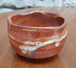 Japanese shino chawan. This was a charity shop find. Despite its modest appearance it isn’t what you might think: a crude and roughly-shaped orange pottery sugar bowl. Oh no. It is a chawan, an unbelievably sophisticated object made for use in the Japanese ritual tea ceremony. I don’t pretend to know anything about the tea ceremony, which has many strict rules and traditions, but the low, wide chawan tea bowl is an essential and central component. Wikipedia lists more than 20 distinct types of chawan, and “the choice of their use depends upon many considerations”[3].
This example is Shino-yaki from the Mino region of Japan. On the base it bears an impressed character 秀 Shū, standing for Shūzan-gama 秀三窯, and it is a modern piece made by the respected kiln master Katō Shūzō 加藤秀三. I only know all this because I posted its picture on the Facebook Collecting Japanese Ceramics and Arts page and received a very helpful reply. This bowl is a fine example of a very important pottery tradition. Don’t know how it got into a charity shop, but now that it’s with me, it’s a keeper.
 Unidentified stoneware flask. This is another shino-glazed piece in a rich dark orange colour and another charity shop find. It has a satisfyingly close-fitting matching lid and is made from a dense buff clay and carries no maker’s mark. I haven’t got much to say about it except that I’m as certain as I can possibly be that it is Japanese in origin. Unfortunately, however, the experts in the Facebook Japanese group are almost equally certain that it is an example of western studio pottery. It will probably remain unidentified, and will become one of those quite-attractive, quite-mysterious occupants of the attic which remain in limbo for years or decades while I’m deciding (or failing to decide) whether to keep or dispose of them. I find that if I call this ever-growing hoard my “research collection” and keep it well out of sight of Frances, I can retain it indefinitely without worrying too much about Obsessive-Compulsive Disorder.
 Crazy cow shell dish. This piece was bought for £1 in my local weekly outdoor auction sale. It is a white earthenware shell-shaped dish hand-decorated in overglaze enamels in blue, green and orange, with the last being the dominant colour. On the back is a pattern number 520 in black, a separate black Z or N, and an impressed mark MEIGH. It was made in Staffordshire around 1805-10 and is unusual because it’s rare to see an example marked for the factory of Job Meigh & Son of Old Hall Pottery, Hanley, Staffordshire. A similar pattern was used by several other factories including Chamberlain’s (Worcester) and Minton’s, whose official name for the pattern was “Kylin”. Collectors call it the “Crazy Cow” pattern.
The Kylin or Qilin (麒麟) is often depicted upon Chinese ceramics. Wikipedia describes it as “a mythical hooved chimerical creature known in Chinese and other East Asian cultures, said to appear with the imminent arrival or passing of a sage or illustrious ruler”[4]. In her memorable ekphrastic poem Nine Nectarines, which celebrates a Chinese porcelain plate seen by her mother in a display case for the Pierce Arrow motor car[5], the revered American poet Marianne Moore (1887-1972) supplies the following helpful description:
“the nectarine-loving kylin
of pony appearance—the long-
tailed or the tailless
small cinnamon-brown, common
camel-haired unicorn
with antelope feet and no horn,
here enameled on porcelain”.
 Sorry, readers, I don’t know what ekphrastic means either, but I’m sure Marianne Moore’s word picture will give you a clear mental idea of exactly what a Kylin looks like. Unfortunately the pottery decorators of Staffordshire in the early years of the nineteenth century didn’t have the benefit of her pellucid poetic vision, and their version of the Kylin was a copy of a copy of a copy of a Chinese original. The result of this process of Chinese pottery whispers was the bizarre appearance of the Minton/Chamberlain/Meigh Kylin, colloquially known as a crazy cow. Look at the centre of my shell dish and you can see why.
 Baluch rug. If you have read a previous posting in my Random Treasure blog which can be found here, or if, much more simply, you have read the fourth paragraph of this piece, you know that I like to collect and study eastern rugs. This is a relatively new passion, and requires significant self-discipline. Severe budgetary restrictions mean that I usually buy only old, worn-out, dirty, damaged specimens; severe space restrictions mean that the inflow of rugs needs to be kept under control because the floors of my house are already fully covered; severe hygiene restrictions mean that purchases require to be quarantined in the garden shed until treated for moths and thoroughly washed; and finally, severe climatic restrictions here in Scotland mean that there are only a few days in high summer when it’s feasible to wash a rug outdoors and expect to get it dry before the rain starts. So not many rugs are bought, and fewer still are admitted into our Random Treasure house. Up until recently, most purchases have been Turkmen rugs, which are endlessly interesting in their variations on a smallish number of design themes and colour variations of red, brown, black and white. But not generally orange.
Lately, however, I’ve found myself getting interested in Baluch rugs. Baluchistan is a large region which crosses the borders between eastern Iran, southern Afghanistan and south-western Pakistan. The rugs are made by nomadic (or formerly nomadic) tribeswomen in a huge variety of traditional local patterns, and using a very varied colour palette, including lots of orange.
The rug illustrated here is my latest purchase. I went to the auction in order to bid for a different rug, but its price quickly exceeded my budget. I had looked at this one and dismissed it as attractive but not sufficiently old or distinctive for my taste, but when bidding petered out at £14, I just couldn’t help myself and caught the auctioneer’s eye. He knocked it down to me for just £16, a ludicrously low price, and now it’s languishing in the shed until the warmer weather comes and I can give it a good wash. It’s a nice prayer rug, probably from the second half of the 20th century, very dirty but in reasonable condition, and, as you can see, it makes prominent use of orange in its strongly diagonal composition.
 Staffordshire pottery teapot. This object has only been with me for a couple of weeks and might, I think, be the piece that suddenly made me realise that I’ve been turning orange. It is a battered earthenware moulded teapot and was purchased because I hadn’t seen one before with this sort-of toffee-coloured orangey glaze. It’s decorated in copper lustre and blue enamel, and the overall effect is quite startlingly blingy. Where it is chipped you can see that the clay body is a buff colour. I have no clues as to age and origin, and the Facebook group experts had no suggestions about which factory it might have come from. So I can’t tell you much about it other than vague guesses that it might be from Staffordshire, perhaps from the 1830s or 1840s.
If you spend time, as I sometimes do, looking at paintings of Victorian interiors which are invariably discoloured by time-darkened varnish, and at old and often dreary black-and-white engravings and etchings, you tend to overlook the fact that our forebears loved to surround themselves with bright, sparkly colours. This cheap, modest teapot is a reminder.
 Terracotta bird whistle. People from all over the world have been making whistles for thousands of years, as musical instruments (tin whistle, fife, recorder) and to provide alerts and warnings (policeman’s whistle, referee’s whistle). These days they are usually made of metal or plastic. In ancient times they were made of wood or clay. They are cheap and children like them, so they make excellent toys (until confiscated for over-use) and are popular as souvenirs brought back from holidays overseas. Because a whistle sounds a bit like a bird, makers have since the time of the ancient Egyptians made them to look like birds. This unglazed terracotta example was in a charity shop priced at fifty pence, so what choice did I have? It’s probably a modern holiday souvenir and I have absolutely no idea where it came from. Don’t even know which continent, but my guess would be either southern Europe or South America.
 Italian maiolica albarello. The tin-glazed wares of the Netherlands and Northern Europe, often classed under the umbrella heading of Delftwares or Faience, tend to be mostly decorated with cobalt blue. By contrast, the tin-glazed earthenware products of Italy, called Maiolica, are a riot of colour. If I had unlimited funds and a free choice of any type of ceramics to collect, I’d probably go for Italian maiolica made from the 16th to the 18th centuries. Sadly, my budget is small and I can afford to buy only a very few damaged and unremarkable early pieces, plus occasional half-decent modern reproductions.
This recently-bought example is in the shape of an albarello or drug jar, and has on its base the hand-drawn rooster symbol of the famous Cantagalli factory of Florence, which was founded in 1878 and continued in the Cantagalli family’s hands until 1936, and then under different ownership until 1987. It is covered with a bluish glaze, and then prettily decorated in blue, green, yellow and purple, but the most noticeable colour is the orange flower-heads. Cantagalli is a well-known name and I see plenty of marked pieces around my local salerooms and antique shops. But this is my first piece, and although it is not a spectacularly good or early one, I find it attractive and will probably keep it.
While researching this section I came upon a morsel of information which surprised me. The founder and creative genius of the factory was Ulisse Cantagalli (1839-1901) a member of an ancient family of Florentine potters. But when Ulisse married in 1880 his chosen spouse wasn’t (as one might have romantically expected) a Tuscan maiden from a respected local artisan or landowning family. Instead, she was a level-headed middle-class woman aged 25, whose name was Margaret Tod, and who hailed from Clermiston, a suburb of Edinburgh, about three miles away from my house. The match was highly successful. Margaret supplied a down-to-earth business brain for the Casa Cantagalli, and remained active in its management for the next fifty years until her death in 1930. You can read the whole unexpected tale in an excellent blog here.
 Scottish pottery porridge bowl. When I purchased the orange teapot (see above), my £10 auction bid also bought an assortment of other more or less sad ceramic objects. One of them was this severely-shaped and badly-cracked white earthenware porridge bowl, transfer-decorated in brown on one side with a two-funnel steam-assisted sailing ship, and on the other side with a sailor sitting amidst the rigging. The funnels and the ship’s sail are overpainted in orange.
I personally don’t find this an especially attractive or appealing object, but I think I know someone who will do. He is one of the members of the Scottish Pottery Society, an august body which I have lately joined, and he knows everything that is to be known about the industrial potteries of Scotland in the nineteenth century. I’ll wager that as soon as he sees this bowl he’ll be able to say exactly where and exactly when it was made, and by whom. If the bowl interests him, he can have it for his collection, which has in it a number of similar objects. He’s away on holiday just at present, but I’ll be seeing him at a meeting soon and will show it to him then – and, for completeness, will then update this blog piece with whatever information he provides.
So, there are nine recently-acquired orange-related objects, comprising one rug and eight ceramic pieces. If this were a more scholarly sort of blog I would proceed now to a psychological and/or physiological and/or behavioural analysis of the reasons why my eye has latched on to this particular colour at this particular time. Is it a yearning for the bright colours and warmth of Mediterranean lands? Is it boredom and ennui with endless dull blues, browns and reds? Have I undergone some undiagnosed brain changes which have enhanced my sensitivity to orangeness? Do I need my eyes tested?
Don’t know. Don’t care. I quite like my new bunch of orange things, but – who knows? – next week I might turn puce.
References
[1] https://yougov.co.uk/topics/lifestyle/articles-reports/2015/05/12/blue-worlds-favourite-colour
[2] Geoffrey A Godden, Encyclopaedia of British Pottery and Porcelain Marks, Revised Edition, London, 1991, page 418
[3] https://en.wikipedia.org/wiki/Chawan
[4] https://en.wikipedia.org/wiki/Qilin
[5] https://books.google.co.uk/books?id=_y0fDAAAQBAJ&pg=PT231&lpg=PT231&dq=chinese+kylin+plate&source=bl&ots=MRivb44QiM&sig=ACfU3U2k0VXjejNHdZ5tjdyKTBgHe7Ao3A&hl=en&sa=X&ved=2ahUKEwiStY3GrajmAhVXQkEAHRJ5BnQQ6AEwEHoECAoQAQ#v=onepage&q=chinese%20kylin%20plate&f=false

An ecphrasis is a literary description of (usually) a work of art, from the Greek ‘ekphrazo’, ‘I speak out’. The original (and some might say best) is Homer’s description of the Shield of Achilles in Book 18 of the Iliad; the technique is used to striking effect in ‘The Picture of Dorian Grey.’
LikeLike
Thank you, Caroline, for defining ekphrastic and thanks also for reading my blog. I don’t know if you have browsed any of my previous postings, but I have written a few times before about the relationship between poetry and ceramics, of an ekphrastic nature or otherwise.
I feel sure you could describe John Keats’s ode on a Grecian Urn as ekphrastic (see https://random-treasure.com/2018/07/04/pottery-and-poetry/), but not Thomas Gray’s Ode on the death of a favourite cat drowned in a tub of gold fishes (see https://random-treasure.com/2019/03/10/lounge-lizard-chapter-3/ and https://random-treasure.com/2019/03/23/cat-murder-mystery/). As for William Upton’s My Grandmother, it is mere doggerel which is interesting not for being descriptive of pottery but for being printed on pottery (see https://random-treasure.com/2019/07/09/alas-poor-puggy/).
LikeLike